

Google's 'G' logo gets a gradient refresh after nearly a decade
techspot.com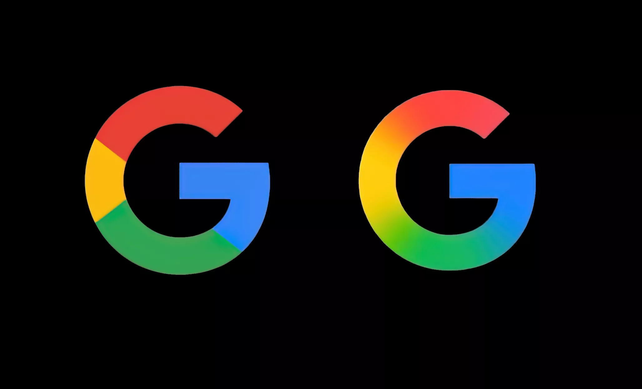
TL;DR: After nearly a decade, Google is giving its iconic "G" logo a fresh new look. The company has quietly rolled out an updated version of the logo, replacing the four solid color sections with a smooth, continuous gradient that flows from red to yellow to green to blue.
The last time we wrote about a Google logo update was back in September 1, 2015. That change was more radical, shifting from serif lettering to the current logo, which feels a bit more modern and informal. That's when Google last revamped its branding, introducing the Product Sans typeface and debuting the four-color circular "G" we've all come to recognize.
At the time, Google was also undergoing broader changes – its parent company, Alphabet, had just turned a month old.
The logo change appears to be limited to the 'G' icon used on mobile devices and the Google app ...
Copyright of this story solely belongs to techspot.com . To see the full text click HERE